Issue with System font in RTF documents
As preservation team of the National Archives of the Netherlands, we received a question. We want to ask you if you can help us find more knowledge about this issue. Perhaps you have encountered it before. You may even have a solution.
And: (how) would you document this issue, knowledge and/or solution in metadata?
Render issue
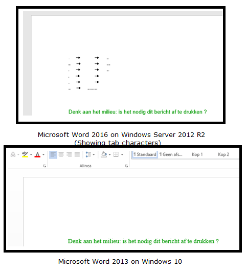
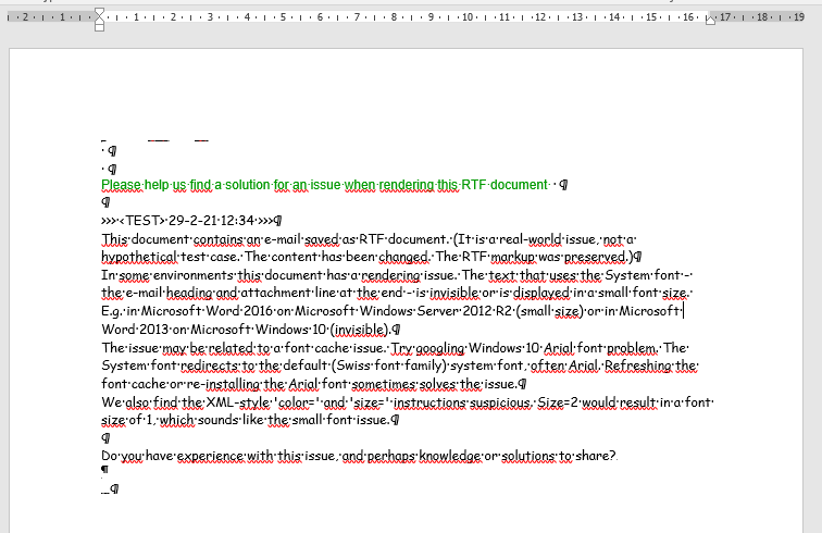
The issue is that some combinations of Microsoft Windows and Microsoft Word render some RTF text in the System font incorrect or not at all, see the area above the green text in the screen shots.
The RTF documents are e-mails exported as RTF, stored in an information system and downloaded for viewing in Microsoft Word. On initial display, the documents are rendered as expected. But as soon as you e.g. double-click the text in the System font, the issue occurs.

We were unable to reproduce this issue in various other environments, ranging from other Windows and Word combinations to other document viewers, both on and offline. But our test was too ad hoc to conclude that the issue is limited to the environments mentioned. Or that it is an issue specific to those environments.
Possible explanations?
In cooperation with the colleagues who sent us the question, we came up with possible explanations for this issue.
One explanation is that the default system font might be corrupt or missing. The RTF instruction to use the System font is in fact an instruction to use the default system font. In this case the default Swiss font family font, Arial. When our colleagues investigated their font list and cache after googling ‘Windows 10 Arial font problem‘, and refreshed their font cache or re-installed the Arial font, the issue was sometimes – not always – solved. Also, using the Arial font directly (and not via an instruction to use the System font), did not seem to result in the issue.
Another explanation stems from the RTF markup itself. The document has the following RTF header (where we changed some values to make different fonts stand out more; business e-mails would e.g. not use the Comic Sans MS font):
{\rtf1\ansi\deff0{\fonttbl{\f0\fswiss\fprq2\fcharset0 System;}{\f1\fnil Comic Sans MS;}{\f2\fnil Verdana color=#990099 size=2;}}This header includes the XML-style “color=” and “size=” parameters. The size= parameter is suspicious. It would result in a font size of 1. The \fs command’s parameter is in half-points. Interpreting a font defintion with size=2 might also result in setting the font size to 1. That sounds like the small font issue. But it is defined for a different font and the color= parameter is not interpreted, so we think this is probably a red herring.
Your knowledge, experiences or solutions?
- We want to ask you, if you have encountered this issue before. Perhaps you have experiences or knowledge to share, or documentation to point to. You might even have a solution for us.
- We are also considering to document this issue in metadata. Perhaps, to keep it manageable, not at the individual file level, but at some higher aggregation. Would you document a possible issue like this? Where? How?
You can send your reponses to me: remco.van.veenendaal@nationaalarchief.nl.
The RTF document
Feel free to save the following code block as an RTF document (a text document with a .rtf extension) and test if you can reproduce the problem in your environment.
{\rtf1\ansi\deff0{\fonttbl{\f0\fswiss\fprq2\fcharset0 System;}{\f1\fnil Comic Sans MS;}{\f2\fnil Verdana color=#990099 size=2;}}
{\colortbl ;\red0\green153\blue0;}
\viewkind4\uc1\pard\lang1043\b\f0\fs20 Van:\tab\tab Remco van Veenendaal
\par Verzonden:\tab\tab 29-2-2021 11:22:33
\par Aan:\tab\tab Digital preservation community
\par CC:\tab\tab
\par BCC:\tab\tab
\par Onderwerp:\tab Issue rendering RTF document with System font
\par
\par \b0\f1\fs20
\par
\par \cf1\f2 Please help us find a solution for an issue when rendering this RTF document \cf0\f1
\par
\par >>> <TEST> 29-2-21 12:34 >>>
\par This document contains an e-mail saved as RTF document. (It is a real-world issue, not a hypothetical test case. The content has been changed. The RTF markup was preserved.)
\par In some environments this document has a rendering issue. The text that uses the System font - the e-mail heading and attachment line at the end - is invisible or is displayed in a small font size. E.g. in Microsoft Word 2016 on Microsoft Windows Server 2012 R2 (small size) or in Microsoft Word 2013 on Microsoft Windows 10 (invisible).
\par The issue may be related to a font cache issue. Try googling Windows 10 Arial font problem. The System font redirects to the default (Swiss font family) system font, often Arial. Refreshing the font cache or re-installing the Arial font sometimes solves the issue.
\par We also find the XML-style 'color=' and 'size=' instructions suspicious. Size=2 would result in a font size of 1, which sounds like the small font issue.
\par
\par Do you have experience with this issue, and perhaps knowledge or solutions to share?
\b\f0\fs20
\par
\par <<File: TEST.htm>>\b0\f1\fs20
\par }
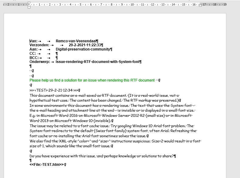
Update 2021-03-08, in response to the comments: below are two screenshots that my colleagues made of the document. First the normal situation, then the issue situation. (Please note that Word was configured to display some markup.)


March 6, 2021 @ 12:37 pm CET
I did some more discoveries: basically depending on the locale[1] configured on the system, lookup of the “System” font may fail. I had the computer of my wife which has a Windows 10 installation with Russian language, and a Russian locale configured. I was able to kind of reproduce the issue with Word, but only if the document is “blocked” after a download (you can “Unblock” a document downloaded from internet with the following instructions[2]). In all the other cases, the “System” font is just not looked up properly, and fallback font is picked. What it could be happening in your systems is that they are using a different locale, other than “English (United States)”: “System” typeface font declares to be an English font, and Windows documents that when the font language and the locale doesn’t match, search may be affected[3]. Consider that the locale not necessarily is related to the language of your operating system, or the internationalization settings, like the hour/date format. The first experiment to mitigate the issue could be to try to change the locale of the affected systems, and try to configure them to “English (United States)”, as documented here[4]. This should be seen as a temporary fix, as the locale configuration may affect other applications behavior, especially legacy one. I try to see if I can find a less invasive fix in my wife’s computer.
[1] https://en.wikipedia.org/wiki/Locale_(computer_software)
[2] https://thirtysix.zendesk.com/hc/en-us/articles/202921675-How-to-Unblock-a-File-Downloaded-from-an-Email-or-the-Internet
[3] https://docs.microsoft.com/en-us/windows/win32/api/wingdi/nf-wingdi-enumfontfamiliesexa
[4] https://www.isunshare.com/windows-10/change-system-locale-in-windows-10.html
March 4, 2021 @ 9:11 pm CET
Dear Rvan, I didn’t ask for the original problematic document, but a screenshot of test reproduction RTF you posted here, with the zoomed affected font before breaking. Anyway, I will try to tell you my hypothesis, based on experience on a previous similar case: font lookup is not an exact science, it’s a best effort. Also, depending on the way you search for fonts, you can get different results. The “System” font may not always mean the “Windows default font”, or the application default font. System font may also refer to the System typeface family of fonts [1], that is actually default installed in a couple of systems I checked (it’s actually called 8514sys.fon, but implements the “System” family). My systems are not affected, but I see exactly that “System typeface” font in my renders. So, what may be happening is that at the beginning a “System” font is looked up in a way, maybe the lookup fails and it finds a default font (for example Arial, that’s why I asked you a screenshot of the font before breaking). Then you double click on the font and Word decides to re-render the paragraph, looking up the “System” font again in the cache but searching it in a different way and finding a wrong font (hence the break you are seeing). This may be happening, but this is just a wild guess, because the System typeface font is truly missing from the affected systems. Also you may want to check the registry keys [HKEY_LOCAL_MACHINE\SOFTWARE\Microsoft\Windows NT\CurrentVersion\Fonts] and [HKEY_LOCAL_MACHINE\SOFTWARE\Microsoft\Windows NT\CurrentVersion\FontSubstitutes] in affected/non affected systems for differences. I hope it helps.
[1] https://en.wikipedia.org/wiki/System_(typeface)
March 4, 2021 @ 7:40 pm CET
Dear Francesco,
I’m sorry, but I can’t share a screenshot of the normal situation. The document is not a publicly published document yet.
What you could do to get an impression of the normal situation is make an RTF document from the code block at the end of the blog and open it in Word on Windows.
Kind regards,
Remco
March 4, 2021 @ 6:55 pm CET
Please, on the malfunctioning environment, please show a screenshot of the first render when it’s correct, before the double click that break it. Please show it zoomed so we can visually understand which kind of font is picked.
March 4, 2021 @ 5:37 pm CET
Nothing useful to add in regards to this specific issue but it does remind me of the fonts paper from iPres 2009 from Geoffrey Brown and Kam Woods https://stanford.edu/~jrjacobs/iPRES2009Proceedings.pdf (P30)